USB Drive Detected but Won’t Open? What to Check First
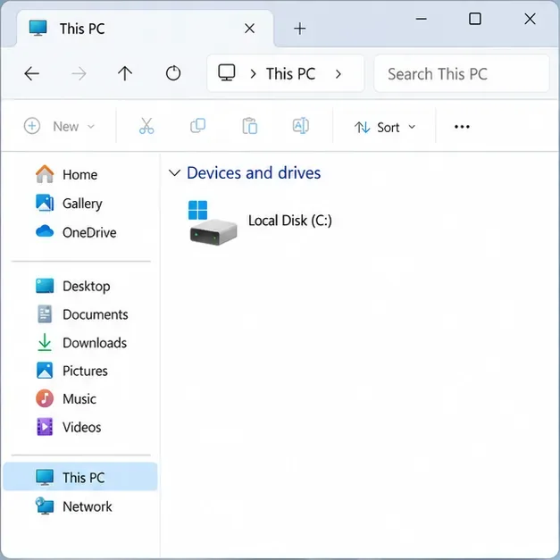
Check a detected USB drive safely in Windows or macOS. Learn what to inspect before assigning a drive letter, mounting a volume, or seeking recovery.
A photo can look vivid in a phone’s camera roll, softer or more tightly cropped in a social feed, and different again on a laptop. That does not automatically mean the phone camera failed or the platform damaged the original. The displayed post may be a resized copy, the app may have applied an edit or crop, and the two screens may interpret color and brightness differently.
The fastest way to narrow it down is to compare the same image at each stage: the original in the camera roll, any edited or exported file, and the published post. Keep the original untouched while testing. Social platforms do not publish every detail of their photo-processing pipelines, and the exact result depends on the service, upload method, app version, file type, and display. The causes below separate documented behavior from variables you can check yourself.

| What you notice | Likely explanation | Useful check |
|---|---|---|
| The framing is different | The post preview or feed uses a crop or a different aspect ratio | Open the post itself and compare its edges with the original |
| Fine detail looks softer | The displayed copy may have been resized, recompressed, or enlarged beyond its pixel dimensions | Compare pixel dimensions and inspect at the same zoom level |
| Colors look duller, brighter, or warmer | Display settings, color profiles, HDR handling, or edits may differ | View the same file on another calibrated or familiar screen with display enhancements off |
| The uploaded copy already looks different in the editor | An export, format conversion, or cloud backup setting may have changed it before posting | Compare the camera original with the exact file selected for upload |
| It looks worse only on a weak connection or in one app view | The app may be showing a temporary or lower-quality preview | Wait for loading, use a reliable connection, then revisit the post |
Social apps need to display photos across different screens and network conditions. A platform may create a smaller delivery version or adjust the image to fit a post layout. Reducing the number of pixels or encoding a new file can make fine texture, hair, foliage, and small text look less crisp. Strong contrast edges can show halos or blocky patches, especially when the image is enlarged after it has been reduced.
What is documented differs by service. Facebook says uploaded photos are optimized for visual quality and that quality can depend on the device’s network conditions. That confirms processing and upload conditions can matter for Facebook; it does not establish a universal compression setting for every social network. Exact resizing thresholds and encoding choices are not consistently disclosed publicly, so avoid assuming a particular pixel limit unless the platform’s current help page states one.
Try viewing the published post after it has finished loading and compare it with the camera original at the same on-screen size. If only the feed thumbnail looks soft, open the post or view it on another device before changing your edit. For future uploads, export one copy at a sensible size for the intended placement and avoid repeatedly saving JPEG copies; each lossy re-encode can discard information. Keep a full-resolution original separately.
Facebook’s current photo-sharing guidance recommends a strong connection for upload quality. That is a service-specific recommendation, not a guarantee that Wi-Fi will preserve every detail or that mobile data always lowers quality.
A crop removes part of a photo. If a tall or wide original is shown in a different-shaped feed tile, the preview may trim the edges or scale the remaining area to fill the space. A subject can appear larger while retaining fewer pixels, which makes the crop look softer when zoomed. Profile grids, story formats, and feed previews may also show different portions of one post.
Check the actual post rather than judging only its thumbnail. Compare landmarks near the edges and look for a crop or zoom control during composition. If the final framing matters, make a separate copy with the subject placed inside the visible area for that post format, and preview it before publishing. Avoid enlarging a small crop back to the original dimensions; interpolation can make it bigger without restoring detail.
Brightness, color temperature, contrast enhancement, and ambient light can all change what your eyes see. A bright phone with a vivid display mode can make a photo look punchier than a laptop screen. Night or eye-comfort modes can make whites warmer; automatic brightness and HDR display can change the apparent highlights. A screen comparison is therefore not a reliable way to prove that the uploaded file’s colors changed.
Color profiles are another factor. They describe how numerical color values should be interpreted by a color-managed display. Apple documents Display P3 as a color space with a wider range of colors than common sRGB workflows. If an image is exported, converted, or viewed in software that handles its profile differently, colors may not match perfectly. The exact impact depends on the file and viewing path, so do not assume every color difference comes from a profile conversion.
For a fair comparison, turn off Night Shift, blue-light filters, vivid display modes, and automatic tone adjustments temporarily. Set both displays to a similar brightness and view the same file in a color-managed photo app if available. If the picture matters for print or professional color work, use a calibrated monitor and an export workflow with an embedded, widely supported color profile rather than relying on a social feed as the reference.
Modern phones can capture photos with high dynamic range (HDR), which preserves a wider range between shadows and highlights. A screen or app that supports HDR may show brighter highlights than a standard dynamic range (SDR) display. When the image is converted for a service or viewed on a display with different HDR support, the result can look flatter, darker, or differently toned. Apple notes that iPhone uses HDR for photos when it is most effective; that does not mean every social app preserves or displays the same HDR version.
File format can also affect the path. iPhones can save images as HEIF or JPEG depending on settings and model. Apple explains that HEIF media may be converted when transferred to devices or apps that need a more broadly compatible format. A conversion is not necessarily harmful, but the converted file can differ in size, color rendering, or detail depending on the export settings.
Check the exact file selected for upload. If it is an edited copy or a cloud-downloaded copy, compare it with the original in the camera roll. Apple’s HEIF and HEVC guidance describes compatibility and conversion behavior, while its iPhone HDR settings guide explains HDR capture controls. If you need predictable cross-app compatibility, test one JPEG export in sRGB before changing the capture format for every photo.
Not every difference begins at the social network. Editing apps can crop, sharpen, smooth skin, apply a filter, change exposure, or export at a lower resolution. Some cloud-photo services offer storage-saving backup modes that can compress files or change their format. Google Photos, for example, says Storage saver uploads may be compressed into a different image format such as JPEG. This setting applies to Google Photos backup; it does not explain what Instagram, Facebook, or another social platform does to a separate upload.
Before posting, check the file information for dimensions and format, and compare the selected file with the original. If the image has passed through Google Photos, check its backup quality and whether you downloaded the original or a saved copy. Google’s backup-quality documentation distinguishes Original quality from Storage saver. If the file already looks different before upload, adjust that export or backup path first.
If the original looks right in the camera roll but the exact upload file already looks different, the cause is likely in editing, export, transfer, or backup. If the upload file matches but the published post is softer or cropped, platform display processing or the post layout is more plausible. If the file looks different only on one screen, display settings or color handling may be responsible. These are diagnostic clues, not proof of a particular internal platform algorithm.
Platform menus, upload features, and image processing can change. This reference reflects the official support and manufacturer documentation checked on September 30, 2026. Where a service does not publish its precise photo pipeline, the limitation is stated rather than inferred as a fixed rule.
Check a detected USB drive safely in Windows or macOS. Learn what to inspect before assigning a drive letter, mounting a volume, or seeking recovery.
A one-person video call echo usually points to one device or room. Learn whose audio may be looping and how to isolate the cause safely.
Learn why social media photos may look softer, cropped, or different in color, and use a practical checklist to identify compression, display, HDR, and file-format causes.
Find out why a browser extension returns after removal, then check sync, management policies, and unwanted software with practical steps for Chrome, Edge, and Firefox.
Prepare for a lost phone or laptop by checking passkey sync, adding an alternate authenticator, securing account recovery options, and testing access in advance.
Find the right iPhone or Android setting to limit background mobile data, block cellular access for one app, or reduce usage across your phone.